
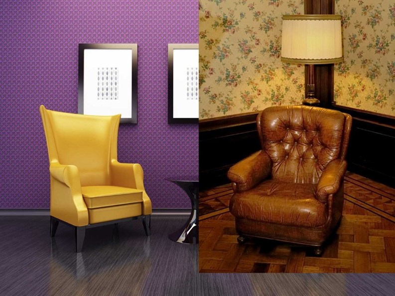
Allegedly, on his death bed and with his last breath, the great writer Oscar Wilde said, “This wallpaper is dreadful; one of us will have to go.” The quote conjures a mental picture: Wilde, pale and bedridden, propped up on massive Victorian pillows, surrounded by his dearest friends and loved ones. And on the walls, perhaps wallpaper with monochromatic flowers on it, or maybe wilting ferns (both popular at the time).
Dazzling...or Disastrous
Whatever the design was that Wilde found so offensive, the quote might also invoke other memories of all the unpleasant interior design choices we see in our lifetime. From that first apartment you rented where the landlord inexplicably thought glossy yellow paint would be ideal for the stairwell (causing the walls to look perpetually wet) to the dusty fake flowers sitting for decades on the hutch in your parent’s foyer; interior design can be dazzling or disastrous. And when it applies to the common areas like lobbies, hallways and community rooms of a condo or co-op building, good taste is largely subjective.
That's not to say that it's not important to make smart design choices when it comes to your building's common areas; a shabby, outmoded, or tacky entry hall or lobby can impact how both residents and visitors—as well as potential buyers—feel about your building community. Just like a classic Chanel jacket or an iconic pair of Levis, there are a few tried-and-true choices and guidelines about what is understood to be “good interior design” as well as some design choices that are never a good idea no matter where the building or what the era. We asked a few veteran interior designers about what constitutes 'good design' and how to avoid costly (and embarrassing) design blunders in your building's common spaces.
“If people walk into a building and are turned off by the aesthetics, they are not going to want to live there,” says Susan Lauren, a principal at Lauren & Chase Design Group, Inc. in Manhattan. “Design is important, because if it's a 'wow!' lobby and a beautiful common area, it's emotionally appealing to people and all of a sudden, they're going to want to live there,” says Lauren, a state-licensed, NCIDQ-certified and LEED Green-certified interior design professional.
It's About Time
While you might think an oversized, vintage eye chart from Restoration Hardware would look amazing in the elevator lobby of your building; your condo board president might think that space would be better suited with a Breakfast at Tiffany’s poster. And really, while neither of your personal tastes are 'bad,' neither of them really belongs in a public, common space either.
As Jeanette Hubley, an associate ASID member and the owner of Manhattan’s Hubley Design Interiors, LLC points out, “Good design incorporates many variables—lighting, scale, and proportion. Common spaces should be warm and inviting. The color scheme should be a neutral palette—fresh and clean—such as beige, browns, greys, and off-whites. I avoid bright colors such as red and purple. These elements need to last about ten years at least, and the neutral tones maintain their appeal much longer than the bright colors do.”
Joel M. Ergas, FASID, NCIDQ-certified and a principal of Manhattan’s Forbes-Ergas Design Assoc., Inc. concurs with Hubley and suggests that because the lifespan of a lobby is indeed between ten and 15 years, you don’t want to be too “cool or trendy.”
Hubley also suggests that “Ill-advised motifs or elements come from a designer who may be looking to make a personal design statement at the expense of the client or building. Even if the artwork that will be displayed in the common areas is outrageous, the environment that they are displayed in should be neutral and well suited for the building.”
She points out that although design elements of a common area might seem straightforward, and that any design committee might be able to pick colors, motifs and any furniture or decorative items easily, there are many factors that come into play when making sure the design is aesthetically pleasing, timeless in style and inoffensive in choices. “Design inspiration is taken from the building location, and style—and the building tenants and shareholders complement these decisions,” she says. “Oftentimes, one item like a light fixture or a rug drives the style and mood of the entire project.”
Going it Alone
If you aren’t working with a design firm but rather a non-professional design committee to design and decorate your common spaces, Hubley recommends a few guidelines to avoid mistakes.
First, “establish a color scheme preference.” As already stated, neutral palettes work best and are most forgiving to various levels of lighting and space. Next, you should “establish the style/period of the building. The overall feel and look should work with the style of the building. For example, a pre-war building calls for more classic and updated details, like heavier crown molding, whereas a downtown high-rise calls for a more simple line, contemporary look.” Additionally, lighting is most often the key to a successful design scheme. Will the space be lit by overhead lights; will there be wall sconces? “Consider the placement of the fixtures as well as the desired light levels,” says Hubley. “It is typical to do a ‘feature’ piece near the elevator, or on landings in the building. I like to do an upholstered bench or a console table with a large wall mirror flanked by wall sconces. The size of the table or bench should be proportioned to the elevator lobby wall length.”
Ergas points out that “You have to start with function and see if design can be the solution to processes that are not now working, or that have just become outdated. This typically comes into play when designing for concierge desks, mail rooms, and even types of seating. It also involves providing built-in solutions for protecting walls and desks and furniture from damage that happens in everyday usage.”
Ergas says that some non-professional blunders to avoid include “inappropriate scale, bad lighting, aggressive colors, too personal solutions, design solutions that are inappropriate for the building location, architecture, and population.”
A Gut Rehab
When you aren’t starting from scratch, but rehabbing existing designs, Hubley suggests that present conditions might alter what choices and options you have. “Once the condition of the walls is addressed once any wallpaper is removed, the walls must be properly prepared for the new wall covering that is installed, otherwise, the results can be disastrous.”
And while everybody is concerned about the bottom line, there are some times where strict penny-pinching can backfire—and common area design is one of them. “If you don’t buy the right materials that will stand the test of time in terms of durability, especially in high traffic areas, it will look worn and frayed very soon,” says Lauren. “After you’ve made a design commitment and spent money on a re-design, you want it to last you ten or 15 years. Very often when buildings decide to do it themselves, they want to save money. But they end up saving money not just on the designer but also on the materials and furnishings they select. They go for things that are inexpensive and that are not appropriate for high traffic areas and they wear out very quickly and show stains,” she adds. Needless to say, that's not a good look.
Making Choices
Once you have taken into account the daily traffic and needs of your common spaces, considered your budget and addressed any damage or repairs that need to be made in order to safely and efficiently design and decorate the space, you need to make good design decisions, which may seem obvious but can be hard to define.
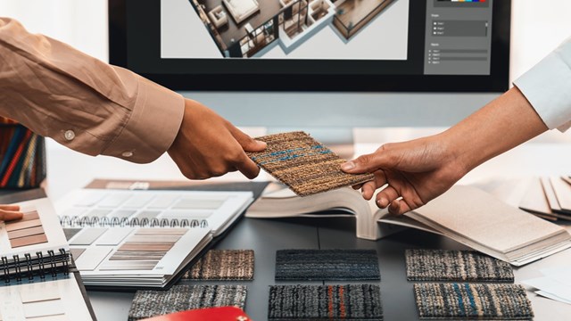
“I truly believe in narrowing the choices of carpet, lighting, paint colors, wall covering, and decorative objects,” says Hubley. “The client should get large sample sizes of the final design schemes and narrow that to two choices and put them in the space for comparison and final decisions. For example, one yard of wall covering, paint a door and obtain some long lengths of moldings and paint the desired paint colors, get a sample of the light fixture and install it with the preferred light levels. Test the combinations. The design committee can weigh in on the options and feel the finishes in place on a smaller scale than the actual, but it will give a more accurate picture of the final look.”
Ergas, however, cautions any design committee to be careful of the final result. “There is no formula for ‘good bets.’ The designer or design committee must always consider the fact that interiors are tools for people and that they are an important component when added to a space. They bring color, movement, and personality.”
Hubley agrees. “For me, a pitfall is dealing with someone who is not thinking through every design element and how each item relates to another as a whole.”
Part of Hubley’s job is to talk clients out of poor design choices. “Trust and design expertise are the tools that are used to assist a client in making wise decisions, for example—providing examples to the client can assist the professional in guiding the client to good design choices. Demonstrating other successful projects that are similar in style and scope are also useful tools. Ultimately, it comes to the client’s choice but I do feel choices can be guided.”
Ultimately, Hubley says, “People want to feel good about their home. A pleasing ‘sense of arrival’ means a lot, not only to a person’s well-being but also to the value of one’s home. If there are three or four buildings a potential buyer is considering, the location and the building’s amenities will make a difference to the overall sale. Poor design is a contributing factor to the decrease in value and in sales potential. Hiring a designer provides value, not only to avoid mistakes, but in the value of the design elements that go into a lobby, hallways and common spaces. Designers have access to trade resources and design sources that can make a space more unique and interesting.”
A Grand Design
Ergas concurs. “Qualified designers, through training and experience, can envision concepts that do not yet exist, except in our minds or on paper. Concurrent with dealing with the functional aspects, the designer is conceptualizing on the aesthetic aspects…..floor and wall materials, colors, lighting, size and scale. We take it one step further by doing actual mock-ups in order to confirm our own choices and to demonstrate them to the board, committees, shareholders and unit owners. Subjectivity is not advised in the lobby, the elevators or hallways in high-rise residential buildings,” Ergas says. “Egos need to be checked at the door, in lieu of objectivity as to what is the best for the individual building.”
Rebecca Fons is a freelance writer and a frequent contributor to The Cooperator.


Leave a Comment