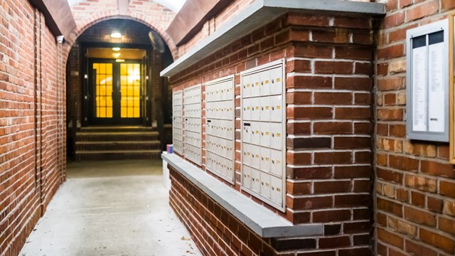
Is the entryway of your building looking less than inviting these days? Perhaps the lobby isn’t as cozy and welcoming as residents might like, or maybe it’s the mailroom that needs some work. If it’s been years since the last time your common areas were updated, and they’re showing their age, it might be time to consider sprucing them up a bit.
In general, common areas begin to show wear-and-tear in about five to ten years. You may have noticed that wall coverings are beginning to peel, doors are scraped and scuffed, or that carpeting is becoming threadbare and worn. Simply updating and refurbishing will not only make these areas more functional, but also transform them into appealing, pleasant places to be–whether someone is just passing through or taking a moment to sit down and relax.
First Things First
Whether you decide to completely transform a given common area, or simply update some accessories or colors, the first concern is where to begin. "You should have a master plan for what direction you want to take," says Gordon Roth, president of Roth Painting in Manhattan. After you’ve voted to refurbish your lobby, it’s a good idea to decide what specific issues you’d like to concentrate on, if you haven’t considered this already. Roth suggests having architects or designers present you with a proposal for different treatments.
Factors to consider before selecting a contractor or interior designer to do the work include the total project budget, expected completion time, and any guarantee the contractor may offer.
You must also consider your residents–if you’ve decided that the lobby needs extensive work, chances are that the project will take a while. While a slight inconvenience is expected during larger-scale projects, steps must be taken to keep the work area safe, with minimal hassles to those passing through; consider the average age of your residents, if any exits will be temporarily blocked, and what time of year would be best for the project in terms of heat/AC conservation and drafts from any open doors.
Also keep in mind the style of your building when deciding on design elements. Tempting as it may be to make a wild departure from what’s been there for decades, more conservative design choices will better stand the test of time and are less likely to draw fire from residents with differing tastes.
Function Before Form
Important as the look of the final result, when planning a rennovation, a board should consider functional issues first, says Marilyn Sygrove, president of Sygrove Associates, Inc., Manhattan interior designers and space planners. For example, do doors work properly? Are they aligned correctly? Is flooring smooth and even? Do lights and electrical outlets function as they should? It doesn’t matter how nice the common areas look if the basic elements don’t function correctly.
Once certain practical matters are addressed, a board must decide what type of atmosphere it’s going for in the spaces to be remodeled; is the goal to maintain a friendly, inviting atmosphere that inspires people to linger, or to create a more streamlined, utilitarian space? Will the space serve as a meeting and gathering place for residents, or just as a conduit to get people from one place to another?
Even if a board decides to make their lobby look and feel like a country club sitting room, certain functional questions should be raised. For instance, does the design of the doorman station allow the doorman to be active, or does it pin him behind a counter? Is the package closet easily accessible to the doorman? Something as simple as changing the position of the counter could give the doorman a more active role in your lobby, improve traffic flow through the lobby, and shorten the distance from the doorman’s station to the package closet, making the doorman’s job easier and the use of space more efficient.
If major changes aren’t in your budget, smaller cosmetic fixes–like repainting, or re-arranging the existing furnishings–are a less expensive way to spruce up an outdated space. Focusing on one problem spot, like traffic congestion or scuffed flooring can make a big difference and cost less than a full-scale renovation.
The Elements of Design: What to Consider
What does your lobby look like now? How would you like it to look? When answering this question, consider how you will handle elements such as color, materials, lighting, furniture and accents.
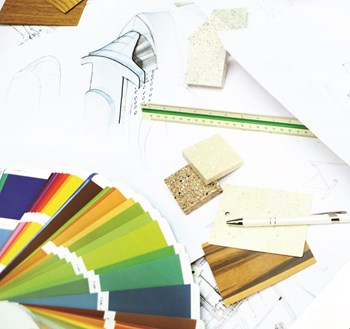
Color and Materials
"Public spaces in residential buildings rarely will be cutting-edge design, unless the whole building has that mindset," says Sygrove. Therefore, your goal when making design decisions should be to appeal to the majority of residents. Since color preference is so subjective, it is wiser to choose a more neutral or traditional color scheme over something loud or edgy that may be fashionable for the moment.
Sygrove thinks that classic materials, such as marble and granite, are always winners. Using real wood and leathers instead of laminates and less-durable, woven fabrics gives a space more distinguished character and insures that the furnishings will last.
Lighting
For energy efficiency, fluorescent bulbs can’t be beat. If you prefer a warmer glow however, you might consider installing incandescent lighting as your space’s main light source or as a compliment to pre-existing fluorescents. Though less energy-efficient than fluorescent lights, nothing beats the warmth that incandescent lighting produces. Often, a combination of lighting sources is the most appealing. For instance, you might use table lamps and sconces along with overhead lights to reduce glare and cozy-up the space. Strategically placed lighting makes lobby areas more interesting, welcoming places to be.
It is important to consider your residents, even when choosing something as basic as a lighting scheme. Remember: Many of them will be returning to the building after a long day of work, and the lobby area is the first place they’ll see. Sygrove suggests keeping in mind that people who work in offices generally work with overhead lighting. "When they come home, they respond best to lighting that is most like their home," she offers. Floor and table lamps can provide cozy pools of light that are a pleasant change from office glare.
Furniture
If the style of your lobby or entry area is more traditional, you may only need to reupholster chairs and couches. However, if the furnishings are obviously outdated and present more of an image issue, perhaps it’s time to invest in something new. Again–beware of fickle trends and radical overhauls. Sticking to classic designs will create a look that will last longer and be easier to update in the future, if necessary. Consulting someone who specializes in the specific style you like will help you stay on track.
Accents
A quick, relatively inexpensive way to transform a room is to add a few live plants. Says Sygrove, "Live plants and flowers multiply the image a hundredfold, and seasonal plants will last many weeks." Potted bulbs are a nice idea for spring, and potted trees and ferns add instant texture and interest.
Paintings or murals also go a long way towards making an area more appealing. After Roth Painting’s work on the Essex House, a hotel on Central Park South that also contains condo units, the center hallway now features a mural of the New York harbor, and the space has been transformed.
The Entry
Not to be overlooked when refurbishing the interior is the actual building entrance itself. Sygrove reports that she has noticed a definite trend this year among many co-ops and condos toward improving their building entranceways. Entryway renovation projects have ranged from simply changing the railing or awnings to updating or rebuilding ramps–making old entrances both aesthetically pleasing and functional.
Updating and Creating Elegance
Of course, the number and type of changes you make are going to be specific to your building. Roth sees an unlimited capacity for change. At the Museum Towers, a 300+ unit co-op on West 53rd St., the board decided to stick with what worked, so instead of going with something new and untried, Roth had the challenge of recreating the way the lobby had looked 14 years earlier. This meant updating and replicating the exact wall coverings and paint mixtures, as well as refinishing the hardwood doors back to their original lustre.
Whether you’re just updating what you have or launching a complete overhaul, the design elements that will work best for you depend on your particular building and budget. But regardless of whether your renovations are grand- or small-scale, re-design will contribute a sense of comfort that is both pleasing to the eye and functional–something residents are sure to appreciate. With a new atmosphere, a refurbished building is a place residents are happy to enter at the end of a long day, and a place they–and you–can take pride in.
Ms. Mannino is a freelance writer living in Montclair, New Jersey.


Leave a Comment