Last November marked the completion of a two-year, $20 million renovation of the lobby of the Empire State Building—a pretty hefty sum just to retrofit such a particular space. While the cost was certainly of large proportions, it is not unusual nor unwise for buildings to heavily invest in their lobbies. This space is the first impression guests and potential homeowners receive and it expresses what kind of building residents and visitors are walking into, both in style and in what kind of service residents can expect.
“I've had brokers tell me that potential buyers come in and based on the common areas, the lobby and hallways, people make their decision on whether they want to buy or see the apartment at all,” says Susan D. Lauren, a principal at the Manhattan-based Lauren-Chase Design Group, Inc. “With new construction going up and real estate booming again, buildings need to stay competitive in the marketplace. Doing a renovation of the lobby, hallway and the common areas really does up your market value. Not only aesthetically but financially it has been known to increase it by at least ten percent.”
Putting in a New Look
A lot of thought should go into how a lobby will look. Various factors—the developer, the residents, the neighborhood, the building-will influence what a lobby will become. Howard Zimmerman, AIA, of Manhattan-based Howard L. Zimmerman Architects, P.C., says that in new construction, there is usually an interior firm that designs the lobby, hallways and other common areas. In the case of existing buildings that need a new or updated lobby, there are architectural firms that specialize in redesigning lobbies.
Lots of factors are taken into consideration before a lobby is designed and built. "In a new construction, [the lobby is discussed] at the beginning when they decide what market they're targeting," Zimmerman says. "In existing buildings, boards have a responsibility to maintain the building and fulfill the desires of their shareholders. And as people pay more and more money for their apartments, they're paying for the look of their building."
One architect with experience in lobby design points out that there are practical reasons for determining what a new building's lobby will look like early on.
"I find that people start thinking about it surprisingly early on in the process," says Robert Cane, AIA, who is principal of Robert Cane Architect PLLC. "First of all, it takes a long time to design a lobby and get consensus from the client and to get all the estimating done. With development projects, they want to purchase the lobby elements along with the large building elements. So that if they're buying $3 million worth of HVAC, they want to have a design for the lobby set so that they know what to buy and get the best prices."
For redesigning or retouching existing spaces, Lauren, a state licensed, National Council for Interior Design-qualified (NDICQ) and LEED-Green certified designer, pays particular attention to the area and the building's residents.
“You look to see the building resident demographics—who is in the building and who do they want to attract to the building. Then you gear your design towards that population. Location and population of the building is really key in planning the design,” Lauren says. She cites an example of planning projects for two distinct areas such as the Upper East Side versus the Village where are you going to be reaching a different audience.
“Upper East Side tends to be more traditional. It tends to be a more classic aesthetic. So very often there we see chair rails, we see nice architectural bones in the building that you want to work with and enhance. The lobbies tend to be smaller than in new construction. You're definitely reaching a demographic that is more mature generally,” she says.
Juxtaposed with, for example, the Village which “is a younger demographic, a more hipper, up and coming, artistic type therefore, the demographics of the buildings that they want to attract are generally single people, young families, the more modern aesthetic. Even if it is an old building, they want to update it,” she says.
Marilyn Sygrove, owner and president of Sygrove Associates Design Group, Inc., in Manhattan, concurs, adding that other factors that designers and architects take into consideration are, “the age group, the structure of the families, what the residents spend their money on and what's important to them. And a lot of it has to do with location. You're not going to get an Upper East Side-type, stodgy formal building in an area with lots of lofts.”
Traditional Elegance but Modern
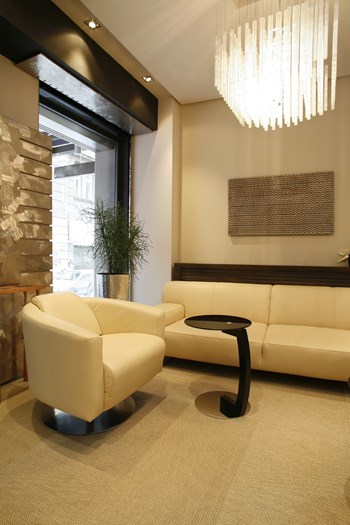
According to Zimmerman, a high-end lobby being designed today is likely to feature traditional materials for a classic look. "Stone floors, wood walls, stone tops with classic sconces, nice lighting, a little material to soften it up," Zimmerman says in describing materials and features commonly used in lobbies. "We try to have new-looking lobbies that are modern but evoke more traditional times with warmer-looking materials." Broker Jeff Sholeen, a senior vice president at The Corcoran Group, describes the lobby of a certain building he knows that he says helps the building stand out.
"It has a library area, a meeting room, there's a billiards room off the lobby, there's a garden in back," he says. "Those type of things really make a difference."
Of course there's always something new and exciting in design, but a lobby that's too visually-striking may backfire. Going with a look that is too extreme may turn off some buyers and may appear dated more quickly than a more traditional look would.
“Because you are dealing with a residential space you want to appeal to a broader spectrum of residents and potential buyers. Therefore, you don't want something that is too extreme in one direction or another—that people will walk in and not understand or not like. The other thing is, if it is too extremely modern, it will get tired a lot faster, like if it is really trendy,” explains Lauren. “But unlike boutique hotels or commercial residential spaces, that have the money and are prepared to redo their spaces every five years, a lobby may not get done for fifteen years. Therefore, if you don't do something that is “safer” you might be stuck with it longer than you want to be.”
"People have to take a somewhat long-term view of what they're doing," agrees Cane. "Something might be very trendy and will look good for two or three or even five years, but then people might look at it and say, 'That looks very '80s.’ Nothing will be completely timeless-and to some extent, any design will be the product of its time, but [going too far with a design] can be a pitfall."
He continues, saying that "It seems to me that there's a greater interest in contemporary architecture with modern materials—glass, stainless steel, simple woods. But if you're working with a pre-war building, you have to respond to the context you're in. It's the rare pre-war building that would look good with a very contemporary lobby."
Zimmerman says the more classic style that is popular among buildings today is likely to remain in fashion longer than previous trends, such as the high-tech look of the 1970s. Zimmerman adds that as he works with clients, he will express an opinion if he thinks the board or design committee wants to do something that might be too much.
"You try to express your opinion and help guide them; I'll explain to them, 'This kind of radical design may look dated in five or 10 years,'" Zimmerman says. "And then you suggest a more traditional approach or less drastic one that still expresses the avant-garde look they want but on a more toned-down basis and let them decide."
Ultimately, of course, the decision is up to the developer or the building staff. "If they say, 'We want the most stylishly lobby possible,' I'll knock myself out for them," Zimmerman says.
Sygrove says that many condo and co-op lobbies are becoming more like what you see in New York's better hotels. "There's a very thin line now between a fine hotel concierge and a residential building—sometimes we can't tell the difference anymore," she says. "Everything from how the building staff is dressed, to very low-key entrances and exits to the desk looking like a hotel desk as opposed to a small doorman station."
It Has to Be Functional, Too
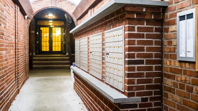
Visitors are apt to judge a lobby based primarily on how it looks, but residents-and smart buyers-need not only something that's pleasing to the eye, but that also serves its purpose. Lobbies need to serve as an entrance with a security system, mailboxes and places to pick up packages. Zimmerman says that sometimes a great-looking design can conflict with a building's functionality.
"Often great architects, or not-so-great architects, go with a modern design, something that photographs well for a magazine but has no practicality," Zimmerman says. "There are a lot of great buildings by great architects that are world-renowned that people hate living in or working in because they're impractical. They look great in photos and win awards, but they're useless as far as the occupants go."
As time passes on, the lobby that did work some years back may not work today. "With time, what is designed today may not be as functional in 15 years as it is now," Sygrove says. "When luxury apartment buildings were first built, they had very limited package storage areas in the lobby; it wasn't something that needed to be addressed up front. Today, where in some buildings you only have one person on staff, everything has to be at that person's fingertips. And there weren't mail order and Internet purchases, so the whole structure of how people live changes over time."
"It's very important to get the planning right," adds Cane. "The function of the lobby, you really have to start there. The doormen and concierge have to be visible—the mailroom has to be the right size." Cane says that package-storage areas are big now and mentions a lobby he designed about six years ago that had a very large package room at the time. Now just a few years later, the building is requesting a bigger room.
A Makeover
Lobbies need regular maintenance of course, but after 15 to 20 years, it may be time to update the area.
“They really should stay on it every ten years. Very often buildings don't have the budget or other priorities take precedence. So it doesn't get renovated until 15 or 20 years and by then, quite frankly, it is worn and tired and you are in pretty desperate need of a renovation,” says Lauren.
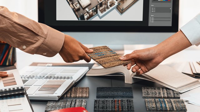
Fortunately, you don't have to nix everything you have and start completely over, she says. “The first thing is to see if they have any design elements that are worth retaining. For example, they might have a great floor or some architectural woodwork that is quite nice. You look to see what they have and start there.”
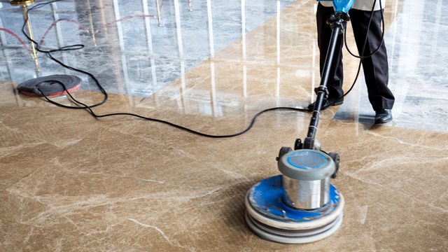
Zimmerman adds that “you can update a lobby with a light-handed refreshing. Sometimes, the decision is made to rip it up and redo it, but normally if it was done right in the first place, it's timeless, and a major redesign isn't necessary. Wood paneling should just have to be refinished, stones only have to be re-polished, and maybe you'll have to update the lighting a little.”
If in the budget, Cane recommends doing a “major overhaul” every twenty years or so. “By then, tastes will have probably changed and unless it is very well done, the look can start to look dated and most people want to be more current.”
He notes that an exception may be pre-war buildings where they might want to retain a particular look such as stone or terrazzo flooring, molding, or cornices.
In the end, designing and retrofitting a lobby is really about creating a balance between functionality and aesthetics.
“You want to feel good about living at a place,” says Lauren.
Anthony Stoeckert is a freelance writer and a frequent contributor to The Cooperator. Editorial Assistant Maggie Puniewska contributed to this article.


Leave a Comment