When it comes to issues of design and aesthetics, New York is the epicenter of all things style. That is certainly the case when it comes to architecture and perhaps most importantly, interior design. For co-op and condo buildings, style and design are keys to providing a unique identity and a welcoming place for residents and their families. In the last few years, design has changed and evolved, representing cultural shifts and the one simple constant that always holds true for aesthetics: times change, and so do people’s tastes.
Green is In
Listening to the needs or wants of a building and its residents is also vital because it can lead to important discussions on the philosophical, financial or even ecological desires that are behind a redesign or renovation. Today, as the green movement continues to gather steam and cost-savings are being associated with energy efficiency, more and more buildings are looking into things such as new lighting, materials made from renewable resources and more.
“I do see a lot of manufacturers creating new ‘green’ materials,” says designer Bob Goldberg of the Manhattan-based firm Interior Design Force, citing wall coverings, carpeting, flooring, and other important pieces of the design puzzle. “And LED lights have been around for many years. They’re decorative, and nowadays they are changeable in terms of color,” which is a relatively new advance. Plus, “green” pieces tend to hold and embody that sleek, contemporary feel that is currently so popular.
Jerold Richland of Richland Design Associates in Manhattan agrees in terms of lighting. “Energy efficient lighting is the norm now,” he says. “It’s nothing new, but what has changed is what’s now being made available, like candelabra bulbs. And the bulbs are able to emulate incandescent lighting now—there’s lots of color, it’s not just cold and institutional lighting.” And this type of lighting can make economic sense. “You leave the lights on all the time in the public spaces so you want it to be efficient,” Richland adds.
The green wave has not caught on everywhere though. Goldberg says his firm has not used too many green pieces in their recent designs “unless it’s been required by management,” but clearly the conversations are starting.
Trends and Designing for the Future
The most popular looks these days “is contemporary, sleek and modern—all of the above,” says Goldberg. In terms of colors, “natural or neutral colors” are in. “Neutrals will always be popular,” he says. “People are going for fresh, clear color—nothing dark.”
As always, building materials play a big part in the look of a space. “Slick materials are being used, as are a lot of recycled materials,” Goldberg says, as well as glass and panels with fabric or metal fused inside acrylic.
One of the keys to good style is an understanding of when a look has perhaps run its course. Goldberg says that a design “should not last more than 10 years. You don’t want a look for 20 or 30 years. You can afford to look trendy,” especially “if buildings try to budget accordingly so they can get 10 years out of a design.”
On the other hand, Joel Ergas, FASID, of Forbes-Ergas Design Associates in Manhattan, argues that there is a difference between a short-term trend and a long-term trend and that buildings should aim as best they can for the long-term.
“I’ve seen trendy lobbies get redone because they just didn’t work,” Ergas says. “You have to compare trendy-ness to valid trends. It’s not about the latest color. By the time you get a project done, those trendy new colors may already have trickled down to the towels and sheets at JC Penney. Trends should be looked at more in terms of being developmental or evolutionary, rooted in a foundation of rationality.”
Form, as the old saying goes, should follow function. Ergas believes that a designer should look at the needs of the building and what is going on in the building before formulating a look for its spaces.
“You should look at changes in operation, at the way the doorman or concierge or management functions,” he says. Technology, too, is another major influence on how a design might take shape. “Instead of sticking a Post-it note on a mailbox to tell a resident they have a package, a lot of buildings are now installing video screens at the front desk where people can find out if they have something waiting for them in the mailroom,” Ergas says.
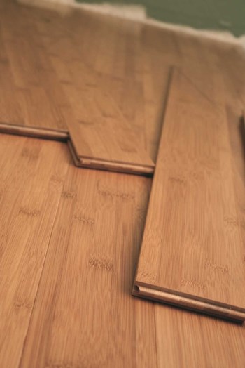
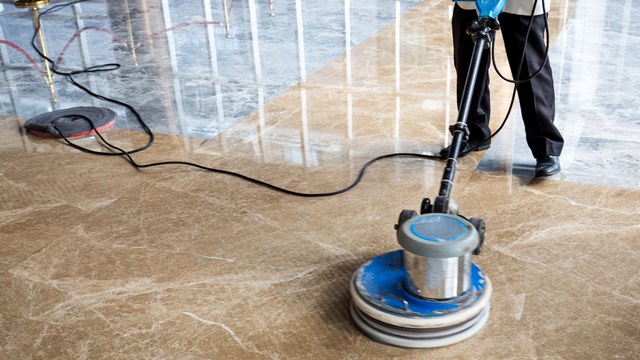
New materials also can impact a design scheme. “As new materials like engineered wood become available, it allows us to use the appearance of real wood paneling where we could not have before,” Ergas says. “Or the beautiful [new] porcelain floor tiles. They can look like slate or travertine or marble, but they’re less expensive and they’re slip-resistant.”
Thinking of the needs of residents and overcoming preconceived design notions are also important. Ergas mentions universal design, another term for accessible design which incorporates ramps and other easier means of entrance and egress.
“People think ramps and they think wheelchairs, but it’s more than that,” he says. “Ramps within lobby spaces are alternates to taking steps and that impacts people with baby carriages, people with shopping carts, people pulling luggage carts and people in wheelchairs. Buildings have really come around [in recent years] to recognizing the importance of universal design.”
Design also should take into account the quality of the pieces being incorporated. People need to become conscious, Ergas says, of buying “quality versus quantity.” It is worth it, he says, for boards and management to perhaps do a redesign or renovation in stages if it means being able to buy quality, long-lasting materials or pieces of furniture.
Perhaps most important is the way that everyone involved looks at the overall design project. It helps, Ergas says, to see the big picture and know that every piece is a key piece to the puzzle. “I find that buildings are really starting to understand all of their common areas as one comprehensive design,” he says. People need to think of buildings “as an integrated whole, from curb to roof.”
Working Together
Good design comes from good relationships among all the people involved. The board has to trust its design committee. The design committee has to trust its designer. And the designer has to know that he or she has the support of the board and management. Communication is paramount and so is a willingness for everyone to work together and perhaps occasionally put aside their desires for the benefit of the whole.
The key to a good design, says Richland, is paying attention to the existing structure. “What you want to do is upgrade an existing structure to its potential,” he says. “Design comes from the personality of the building and the vision you have for the public areas.”
And it’s important to keep to the needs and wishes of the board and residents in mind when creating an aesthetic. “I co-create the design with the design committee,” Richland says. “It’s not my vision. It’s a collaboration. I can make it soar, make it gorgeous, but it’s their home.” And that input is key.
“You have to listen aggressively and honor every comment,” Richland says. And when it comes to working with a board committee, “you should try to please them all—but within the parameters of a great design.”
For Goldberg, that element of trust between board and designer holds the most value. “For the board, they should express to their designer their challenges, problems or limitations and then let the designer figure it out,” he says. And beyond those basics, Goldberg says the committee members should “try not to have preconceived notions of what they want.” Conflict can arise when people hold on to untenable ideas for too long, slowing a project. “Unless the board feels very strongly one way or another about something they want or need, they should try not to limit the designer.”
Putting the design work into capable hands will go a long way toward ensuring a good end result. In fact, that’s one of the most common errors a board committee tends to make. “Not hiring an experienced professional is a mistake,” Ergas says. A designer can help a board make tough decisions by serving as the voice of creative reason. “Sometimes buildings run scared and pander to the great majority,” he says. “But by doing that, you end up with a diluted design.” And in the end, that great majority will not be happy with the results.
Having a clear line of communication is important, too. Problems arise, continues Ergas, when the building is represented by too many or too few people. Narrowing the conduit of communication between board and designer will save time and energy in the long run. And board members or committee members should be willing to speak up and lay out their parameters early on. “They need to be clear about budgets and timelines and telling the designer what their ultimate objectives are.”
With set goals, good communication and a sense of trust, boards and designers can create extraordinary public spaces that will entice new residents and inspire current ones. A good design will incorporate new trends while never ignoring the important things that lend credence and longevity to a new look. Mix all those ingredients together and you have the perfect recipe for making a house—or in this case a building—into a home.
Liz Lent is a freelance writer, teacher and a frequent contributor to The Cooperator.


Leave a Comment