Like people, buildings come in all shapes and sizes. They can range from single-story garden apartments to multi-story high-rise complexes larger than many small towns. What they have in common is some amount of community space, known as common areas. Common areas can be as minimal as a walkway connecting individual units, or as dramatic as lobbies with atriums and pools with sundecks located on the top of a 50-story building. Regardless of size and scope, these shared spaces call for unique approaches to design and execution—and may require redesign to accommodate changing style and function over time.
The Baseline
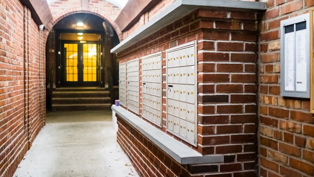
“Different types of buildings have different common area designs,” says Sarah Marsh, principal of MAAI Marsh Architects, an architectural and design firm located in New York. “There are, for example, pre-war multifamily, mid-century, ’80s, and contemporary designs. Generally, the answers for design questions relative to these categories are more or less the same: provide light, bright, easily cleanable solutions for access panels for services like HVAC. Design well-located package rooms. Place art suitable to the location and building type in common areas. Install low energy lighting that is bright and cheerful.”
“Common space needs to be functional, with good traffic flow and multiple lighting sources,” says Claudia Orlando, principal of Blissful Road, a design firm located in Hoboken, New Jersey. “Surfaces should always be durable and able to withstand disinfectants. We also like to create an experience, promoting conversation, providing a comfortable waiting area or a place to sit. Art needs to be soothing and have some connection to the space. Colors should be muted. There should be multiple light sources. (We love dimmers.) Furniture choices should be top grade and promote durability. We use multiple textures throughout our spaces, like wood, metals, stone, microfiber, etc.”
Working with the Community
Marsh explains that “for common area projects, most building boards designate a design committee of three or four people who report back to the board on a regular basis. The committee is usually responsible for finding suitable design candidates, performing due diligence, and interviewing candidates. The chosen designer is often one who has completed similar projects recently, who can provide referrals of project success, and whose fee is seen as good value to the committee. At minimum, the committee should have an abstract vision of what they want to accomplish in new design—a fresh look, something that is easily maintainable, durable, and ‘brighter’ than what they currently have. The designer works with the committee throughout the project, obtaining consensus on proposed materials, fixtures, and finishes. They also determine schematic design, design development, and finally presentation materials with the committee, which are then shown to the board—and potentially the whole community.”
When working with a designer, a board or committee should be very clear about what they want—and what they want to spend to achieve it. The same goes for members of the co-op or condo, if they’re weighing in as part of the process. Marsh suggests some do’s and don’ts:
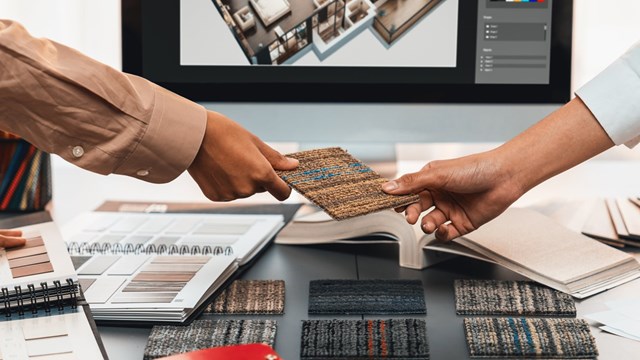
“Make any budget limit clear. Inform all unit owners or shareholders in the building that they will be shown the new design before renovation starts. Choose a designer with whom conversation and exchange of ideas is easy. Execute a short designer/building AIA contract to ensure the design, scope of work, schedule, and costs are laid out at the beginning of the project. Clearly establish the designer’s responsibilities. Always respond promptly to decisions requested by the designer, and view all proposed materials—actual light fixtures, carpet samples, and so forth—prior to purchase.”
To this, Orlando adds: “Always confirm budgets and timelines with the board or committee working with you. Never make design changes after the design is approved. It will just prolong the process and cost more.”
Tricks of the Trade
“A well designed lobby is the introduction to your building,” says Orlando. “It sets the tone and creates an experience that will carry through the halls and other common spaces. A great experience provides value. Lobbies and common areas should be gut renovated about every 10 years. Using upscale fabrics, materials, and furniture can make all the difference in the results when undertaking a renovation.”
“The main reason a building would want to renovate its lobby or hallways is because the existing is either worn out or appears out-of-date,” says Marsh. “Often the lighting is dim, adding to the generally worn and dated look. This is not attractive to potential buyers and doesn’t make residents feel upbeat. Old, dim light fixtures, old wallpaper, worn carpet or scuffed stone floors, faded or discolored paint, scars, chips, and dings all combine to lower the quality of the space. Repairing or replacing all could brighten the whole, without the expense of redesigning layout. In particular, modern light fixtures use low energy. I recommend long-lasting lamps of differing brightness. The right lighting level in the right place goes a long way to brightening a space.
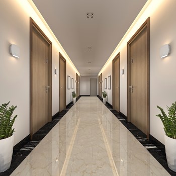
“Entering and leaving a building on a drab Monday morning in November,” continues Marsh, “should be made as pleasant an experience as on a bright sunny Saturday in June. Use a color scheme that is light and bright, light fixtures that enhance the space, flooring that is durable and can be kept clean. Buildings with available budgets can use the beauty of wood paneling to really make a statement. Hallways, which are often narrow, require light-colored walls; adding horizontal emphasis at the ceiling to pull the eye upward and along de-emphasizes the narrowness of the space. Artwork in lobbies and hallways should fit the nature of the building. Antique prints are the right choice in pre-war buildings, [as are] images of local parks or architecture, perhaps black-and-white photos. In any modern building, examples of neutral art are the best choice. Mirrors can and should be used judiciously. They should be sized and placed to make elevator areas in hallways appear larger. Using mirrors in lobbies also enlarges the space.”
Creating a functional common space depends on many factors. And perhaps most importantly, each and every space in each and every building is unique and different and must be treated as such. Design and redesign is a function of architecture and age. Both must be considered in any plan to upgrade and/or redesign your space to achieve optimal results.
AJ Sidransky is a staff writer/reporter for CooperatorNews, and a published novelist. He may be reached at alan@yrinc.com.


Leave a Comment