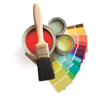
For better or worse, color affects human behavior. Research indicates that practical and aesthetic applications of color, in public and private spaces, can manipulate mood and perception. A board planning to redecorate or refurbish common spaces must carefully consider color choices. What looks best? What does color say about the building and its residents? What impact does color have on the value—both real and perceived—of the building?
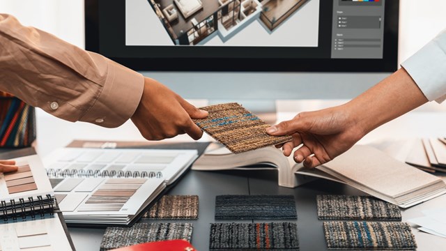
There are reasons behind nations, sports teams, and corporations favoring the colors red, white, and blue…and reasons they navigate away from lavender, burnt sienna and mint green. Casinos, in particular, are big proponents of mood enhancing color as they promote comfort and want patrons to lose track of time. The unusual color combinations of casino carpets enhance all of that.
“The idea that color can affect moods is actually completely based in science,” says Kim Depole, owner of Kim Depole Designs, Inc. Studies validate anecdotal research. “For example, if you are in a red room, it will raise your blood pressure,” she says. “If you’re in a yellow room, you’ll get a headache after a sustained amount of time. A blue room will provide a sense of calm, and a green room will, believe it or not, help you be more articulate.”
New York architect Victoria Benetar agrees. “Each color represents a mood,” she says. “That’s why in schools and hospitals, certain colors are preferred, because certain colors give you peace, while others make you anxious. Red and orange are not colors recommended for a bedroom. These colors would be for a restaurant or someplace where people are active.”
When selecting color, work backwards: figure out a desired mood, and choose the appropriate color. “There’s color symbolism and color psychology,” says Jonathan Baron, ASID, president of Baron Designs and a New York State certified and licensed interior designer.
“McDonald’s uses yellow because yellow makes you hungry. So color definitely has an impact. I may choose a deep rich purple for a building’s logo, or the sign out front, because purple is a color that’s symbolically related to royalty. Now, I wouldn’t do a whole lobby in purple, but the logo as an accent color could be the purple, and the rest of the building could be in beiges and browns.”
How does this apply to a residential building? “The color scheme also needs to make people comfortable to live there,” Baron explains. “So even if there’s a red brick wall, it doesn’t mean I’m going to do the other wall in cherry red. I’m creating color schemes that are gentle, complementary and comforting. I can’t go into a lobby and use dark, dark gray just because I like that color. The people in that building are not going to be comfortable with that.”
When it comes to real estate, the colors must evoke the proper emotions. The hallways have to create a sense of comfort and safety. The common rooms should make a resident want to be there, rather than give a splitting headache. And anyone selling an apartment knows that wacky colors are a big “no-no” when you’re planning an open house (although this writer has had good luck selling property with walls that are not white).
“Recently I walked into a building lobby, and it was trying to make a real contemporary statement,” says the designer Liz Morehouse of Manhattan-based Morehouse Design Associates, Inc. “But they had used so much white, it was so sterile, that you felt like you were walking into a hospital. It had no warm, friendly feeling; it was just very sterile. So you don’t want to overdo white, and you don’t want to overdo grey… it’s too somber. You really just have to mix it up.”
Mixing it up, according to Morehouse, is a combination of art and science. “People respond more favorably to warm colors,” she says. “In a hallway, I might pick a warm beige carpet with an accent of a crisp blue color, a combination of the warm with a brighter color. In a lobby, I might do a sofa in a warm color, but then I’ll put a pop-up color on a throw pillow. And with area rugs, you can mix a whole lot of colors for a lobby, almost like a mosaic tile. So I would mix warm and cool colors.”
In residential buildings, rethinking an entire color scheme is a big project. Designers are aware of this, and try to make their designs have longevity.
“Because fashions and styles change over the decades, I remain conservative with my color choices,” says Baron. “This means working with the inherent architectural material colors. I don’t get real crazy. And if I do use something like chartreuse green, I may make it as an accent wall. But my goal is for these lobbies and hallways to last 15 years. I’m finding that 15 is the number.”
Morehouse has the same life span in mind. “When I’m doing hallways, usually you live with a hallway theme for twelve to fifteen years,” she says. “So you need to think in terms of colors that you’re not going to get tired of. Recently, I redid some halls that had a bright, Howard Johnson’s orange carpet. We ended up doing a dark charcoal background with browns, taupes, and whites and a little bit of gray. Usually in hallways, you keep it kind of neutral, but still have an accent color. If you keep a warm base, you can still have a blue accent or something.”
Depole has found looks that endure tend to reflect nature. “There are trends,” she says. “Tangerine orange was the hot color but that eventually looks dated. I much prefer to find something that relates to people’s sense of well-being, which generally is always related to nature in some way. Not that I have to have a sage green and brown palate all the time.”
Benetar agrees. “I’m a fan of the use of color, because I think that color is a reminder of nature. And this idea of nature is very welcoming. A cold space is not as welcoming as a warm one. Wood is more welcoming than steel and chrome.”
The use of color should be judicious. Some palette is desirable…not just 50 shades of gray. But a lobby shouldn’t look like the Crayola factory, either. “You just have to stay away from the bright reds and oranges,” Morehouse says. “For a while, forest green was a popular color, and that’s out of style now. Colors do vary from year to year, but you want to stick with classic colors.”
Designers look all over for inspiration. “My greatest resource for design is art,” Morehouse says. “It might be from the 16th century, not necessarily contemporary, but I’m definitely informed by that. Matisse is the master of all. If I want a little color inspiration, I go to MOMA. I go to the Reuben Museum. There’s a lucky person there that gets to do nothing but pick the wall color that relates to the exhibition. Sometimes I go there with my color deck, and I’ll match it.”
But if all else fails, take a stroll through the park. “There’s nothing more incredible to inform your color palate than something like fall colors,” Morehouse says. “You can get the nuances of green and yellow just by going out and looking at the leaves in Central Park. What more do you need?”
Coming up with a suitable color scheme is different in an existing building than in a new construction, when the designers are architects can work hand in hand. Older buildings tend to have features that are not alterable, and that must be worked into the design. No matter how much one might dig the “mod” style, that won’t work for a building like the Dakota, on the the Upper West Side.
“When I come to a building, I’m usually a remodeler,” Baron says. “The building was built in the ‘60s, the ‘40s, or earlier. Every building has its own inherent architectural materials and colors. I immediately gather that visual information…that’s how I begin to generate my color scheme. There could be terrazzo floors that are gray, black and beige, or dark jade green. Or there may just be red brick that for some reason ran inside the building. So I have to distinguish with the owners: what are the intentions, what’s the budget, what’s the goal here? And then I’m able to come up with a color scheme.”
Sometimes, color choice can be easier if a building has elements that can’t change—not unlike how a poem can be easier to write if in strict form. Decorating a building is like writing a sonnet, in many ways.
“Our job is to create the many parts of the whole,” Depole says. “What’s the whole picture of the entire building? Is there a branding color for the building? Is there a logo? What is the floor finish? The floor informs the wall, which informs the lighting, which informs everything. It’s all a sum of the parts.”
The residents, too, factor in to how a designer approaches a project. “You have to reflect the clientele that lives there,” says Morehouse. “If a building has a lot of artists living there, you can be a little freer with color choice, do some more creative and fun things. If it’s a Sutton Place building, you might be a little more conservative. If its doctors and lawyers, you want to go understated, not outlandish.”
Boards might think that enhancing the design might be prohibitively expensive. That’s not always the case. In fact, a little color can go a long way.
“When I first became an architect, I didn’t have much money to renovate an apartment,” Benetar recalls. “So I just changed the lighting and the colors, and people said, ‘Oh, my God, what kind of renovation did you do here?’ I used very bright colors and it looked like a different space. Just with color choices, you can do miracles.”
Greg Olear is a freelance writer and a frequent contributor to The Cooperator.


Leave a Comment