There are certain touches that make a house a home. When it comes to designing and renovating co-ops and condos, that same rule applies. Adding touches that personalize a space, and tailoring that space to the needs and desires of the people who live there can make all the difference in the world when transforming four walls into a place of comfort, security and relaxation.
These days, more and more developers have acknowledged the need to build spaces that cater to individual and family needs. More and more buildings are being renovated—and erected from scratch—with children and families in mind. On the flip side of the aging coin, America's growing Baby Boomer population is also inspiring its own array of specialized amenities and accommodations.
The trick to designing useful, welcoming spaces for a specialized community of course, involves designing spaces that not only accommodate these particular demographic groups, but also creating spaces that do not lead other residents to feel excluded. It's a tight rope to walk, but today's designers and developers are mastering these subtle arts, building common areas, entertainment spaces and individual units that appeal to all while still appealing to those select few.
Kid-Friendly
Today's co-op or condo residing children are lucky little devils. In the old days, apartment living meant small spaces, few windows and long waits until that nightly trip to the park. These days, buildings such as Arc Development's Solaria, located in Riverdale, are doing more than ever to reach out to families, including offering such eye-popping amenities as a rooftop observatory—the only one of its kind in the region.
At 20 stories, the Solaria stands 410 feet above sea level. "We knew the building would be taller than anything else around," says Joe Korff, president of Arc Development. "It's also far enough away from the city's lights, so we thought it could work. It's really an entertainment and education experience."
The observatory will include a closed dome with a Meade telescope and room for two. The observatory space itself offers a stargazing deck with a rotating celestial map and comfortable lounge chairs for relaxed viewing. To make the area even more enticing to families, educational astronomy programs and rooftop stargazing sessions will be offered in cooperation with the Amateur Astronomer's Association of New York. Families also received a one-year complimentary membership to the Museum of Natural History.
"People love [the observatory]," Korff says, adding that "it's for the kid in you, not just for kids." The building also offers an indoor/outdoor children's play area and an entertainment lounge perfect for teenagers and their guests. The key, Korff says, is that things like the play area "are not distracting for adults," and—in the case of the entertainment lounge—are designed to be used for a wide range of age groups.
Another building, the Rushmore on the Upper West Side of Manhattan, is partnering with play company Kidville NY to install a playroom for the building's young children, and offering an array of art, music, and dance classes for older kids.
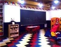
Going even a step further is 170 East End Avenue in Manhattan, a brand-new, 20-story condo development that offers residents and their kids a video arcade, toddler-friendly rooms for projects and playtime, an in-house movie screening room, golf simulators, a squash court, and a dance studio. Clearly, things have come a long way since buildings put a ping-pong table in the common room and called it a day.
Not a Nursery
"There seems to be a trend in the marketplace" toward more family-friendly spaces, Korff says. Plus, Riverdale and its surrounding areas are "good places for families. We're drawing from Upper East and Upper West Sides—family-friendly neighborhoods where people are used to parks and shopping." Korff says it makes sense to cater to the wants and needs of the population from which buildings such as the Solaria will draw its main residents.
Buildings such as the Solaria, which offer amenities enticing to parents and children, yet equally enticing to single adults or couples, may be onto something.
"Having a kid-friendly space doesn't mean having a kid space," says designer M.F. Chapman, CEO of Ispaces Inc., based in Los Altos, California. Chapman's firm specializes in designing spaces not only for adults, but also for children at all stages of development. "It's not the same thing. Having a kids-only space might feel like Romper Room to an adult, but if you say you want a space where kids can enjoy themselves and have a kid-friendly time, that's different. It doesn't have to be games and slides to make it a kid-friendly space. There are lots of ways to make it appealing to everyone."
All it takes for adults and little ones to share space peacefully is a bit of design ingenuity. Lounge areas for adults can be side-by-side with reading areas for children, separated by low walls that offer distance for older people in search of peace yet still provide enough closeness for parents to keep an eye on their youngsters. Panels hung from ceilings can provide separation as well. Attention to color schemes can ease the sense of kid-overload, too. "Choosing colors wisely is important," Chapman says. "No adult without kids wants to feel like they just went into Romper Room. Subdue the tones, and then use some fun art to brighten the space for the children."
Designing Special Spaces
But what if you do want to create a specific kid-friendly area, designed to fulfill their needs and wants as well as those of their parents? There are plenty of ways to accomplish that, but it helps to have the trained eye of an expert and a willingness to think with the wonder of a child.
"The first thing you want to look at is safety," Chapman says. "You want to avoid small things that can become choking hazards." Or things that pose hazards because of sharp edges. "Tables, for example, are not as good as soft ottomans, because kids fall and hit their heads on tables." Chapman adds that you also want to determine early on what the function of the space is going to be—is it a study area for teens or a play space for toddlers? Or is it multi-use—a study area for teens and a play space for the younger set?
Once the function is established, it becomes easier to choose colors and furniture that will appeal to the audiences in mind. In a room for babies, for example, design options might include mirrors that are low to the ground "because babies like to look at themselves," Chapman says. For toddlers, there might be furniture or design elements that include handles and things to grasp and with which to pull themselves up. For the younger set, designers might also choose to go with multi-sensory elements—wallpapers or textiles with a tactile quality. Covering the walls with things that kids like to touch, from nodes to rocks to soft things and furry things can go a long way toward making children feel welcome without overwhelming a space.
The Other End of the Spectrum
More and more co-ops and condos also are catering these days to America's growing retired and senior population, including empty nesters looking to downsize and other older individuals and couples still enjoying a life of independence. This trend is starting, too, at just the right time with experts predicting that soon the over-65 population will outnumber those under 15 years of age.
One of the key differences between building for families and building for older adults rests is a sense of pride. Few people like to have their age and the potential difficulties that come with that age pointed out to them. "Most people don't want to be separated out as doing anything differently," says Pat Spadafora, director of the Sheridan Elder Research Center in Ontario, Canada.
As with young children, safety is a major concern for older residents—though it's something that designers and contractors can create without making residents feel like they have lost their independence. Doing something as simple as improving lighting in hallways and common areas can greatly improve safety.
"Glare can make entering a facility very challenging," says Mary Jane Carroll, also of Sheridan Elder Research Center. "In fact, if the facility can provide gradual changes in lighting so that they eye does not have to respond quickly to entering a brightly lit space or a dark space from out of doors, then the visitor will find the experience easier."
As people's eyesight changes, things like colors and contrasts also can make a difference in comfort levels. Designers should make an effort to distinguish stairs clearly from flat surfaces. "Any carpeting choice that has a checkerboard effect can cause people to feel uncertain, as the darker areas of the carpet can be read as holes," Carroll says. "This also applies to stair treads that may appear to be dark holes. It's better to choose a lighter color and to band the edge of the tread to define the stair, rather than use a dark material. Also, high contrast between flooring and walls is imperative in order to ensure that partially sighted people can discern where the wall ends and the floor begins."
Comfort also plays a large part in creating a friendly environment for older residents. For example, putting levers on sinks instead of knobs is easier on hands that might be affected by arthritis. Choosing friendly, warm color schemes can make a space more inviting as well. Designers should be aware of the fact that as people age, the lense of their eye yellows, causing a shift in color perception. For example, says Carroll, a deep forest green could appear black.
When it comes to amenities for older residents, exercise facilities are a strong selling point as are things like personal gardens that can be tended by residents themselves, encouraging activity, fostering community relationships, and helping them maintain "a sense of purpose," Carroll says.
Not Just Physical
Besides physical design, the social arrangements of the building are important, too. "It helps to create private space within a public space," Spadafora says. "Create common areas that encourage people to mingle. You want to encourage people to talk with one another, because otherwise they might just stay in their apartments. De-socialization tends to be a bad thing for older adults."
Perhaps more than anything, however, it is imperative to remember the individual versus the demographic. It helps to simply ask building residents what they want and need. If a renovation is coming up, "Ask people who will be using the space," Spadafora says. "It surprises me how rarely people ask." It helps to remember, too, that "older adults" does not just refer to one age group. "You can't compare a 60-year-old to an 80-year-old," Spadafora says.
All building residents have different needs and wants, but with careful planning and open dialogue with unit owners, it's possible to build a space that welcomes, comforts and encourages community for individuals and families of all ages.
Liz Lent is a freelance writer and a frequent contributor to The Cooperator.


Leave a Comment