Alyssa and her fiancé are on the hunt for a condo in Brooklyn. They came into the process with their wish list (in-unit washer and dryer, hardwood floors, lots of light) and their must-have list (two bedrooms, one bath and something more than a kitchenette, on a safe street). What they didn’t think about is the space outside their condo door: the building’s common spaces. “I didn’t even consider what we wanted in the lobbies and hallways of the building,” says Alyssa. “It seems like such an afterthought or something you can look past, but I’ve seen some really, really gnarly lobbies. “ Alyssa went on to say that her realtor will often warn them that “The building is a little dated,” which translates to “The lobby looks like a ghost ship from 1983.”
A Matter of Priority
Plenty of buildings and homeowners associations have common spaces, and plenty of those spaces go years—sometimes decades—without an style update or overhaul. It makes sense; when you’ve got bigger fish to fry, like needing to reseal the roof or dry out a flooded basement, picking out a more modern paint color or updating carpet runners in the hallways might not seem like an efficient use of a board’s time, and certainly not their budget. But aesthetics and curb appeal factor significantly into property values, and by extension the likelihood of prospective buyers like Alyssa and her fiance to make a purchase in your building.
“I’ve had brokers tell me that sales are won and lost even before the client sees the apartment,” says Susan Lauren of Lauren Interior Design in Manhattan. “If you’re looking to put down a large sum of money, perhaps your life savings, and on the way to the apartment you are disappointed with the lobby, the elevator, or the stairs…if they look shabby to you, who cares how fabulous the apartment is? Renovations of this kind can affect unit sales by 10 to 15 percent in most cases.”
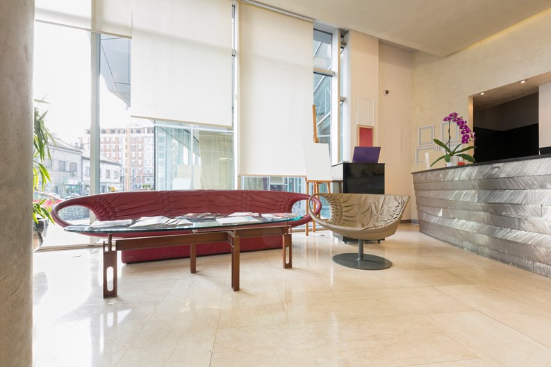
Serena Spates, marketing manager at Interior Motif in Hoboken, New Jersey agrees. “Common areas are often the first thing that potential buyers and/or renters see when considering a property, and are considered to be focal points of most buildings,” she says. “First impressions are everything, and can go a long way in determining whether they are interested in moving forward to view the unit. If the area is unkempt or looks cheap, it may give the impression that they won’t be able to count on the [board] to handle repairs and replacements in the future. Buyers also look at common areas as extensions of their homes. Whether it’s the concierge desk, outdoor pool area, game room and/or meeting room, these are areas people want to make sure are comfortable and inviting enough to entertain guests.”
Cheap Up(date)
So the stakes are actually fairly high. Luckily, there are a lot of ways you can spruce up your common spaces without digging too deeply into your building’s coffers, or raiding the reserves.
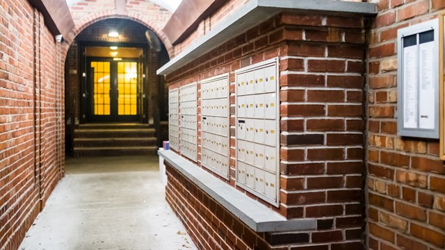
First, recognize what is usually the first to crumble in common spaces. “Typically elements that endure the most wear and tear are things people are constantly touching or using, says Spates. “The concierge desk, chairs, floor coverings, light fixtures and walls are all items that will get worn and will need to be replaced regularly. Hallway wall repairs are actually the most common, as they undergo quite of bit of wear from people moving in and out or during renovations.”
John A. Buscarello, an interior designer at John A. Buscarello, Inc.-Interior Design, in Manhattan, stresses that not all buildings are the same. “It’s important to know the building and how the space is used,” he says. Which means you might need to focus your attention at paint or carpeting, furniture, or doors. And, adds Spates, one way to cut costs of repairing and updating these elements is by thinking ahead. If possible, during installation, renovation or updating, “It’s really important to buy extra carpeting, paint and wall paper that can be stored away for damages and small repairs that may occur in the future. Having an extra supply allows wear and tear to be addressed quickly, easily and cheaply.”
If you don’t have the luxury of extras, there are plenty of ways to update on the cheap. As Buscarello points out, “A good coat of fresh paint can do wonders.” Changing the wall or ceiling color to a neutral grey or taupe can instantly modernize the space, and usually seamlessly connects to adjoining hallways, whatever their color. Both Buscarello and Spates suggest updating light fixtures – though keep in mind that better lighting might literally illuminate larger problems (things like mysterious carpet stains, cracked ceiling corners, etc.), so choose wisely - and flatteringly. If you can find the right fixture, Spates notes that, “Lighting fixtures are everything when it comes to hallways and vestibules. They can take a small, enclosed area from dark and uninviting to light, bright and open in no time.”
If board members or maintenance committees can agree on what, larger accents like area rugs and artwork can make a big impact. Consider embracing vanity – Spates notes that mirrors can bring more light into a room.
It also pays (or saves) to think outside the box (or lobby). Buscarello suggests that upgrading apartment numbers and doorbells can help liven up hallways, and you can get creative on your wall coverings. “Paint or paper just one wall as a feature wall…wood paneling on a feature wall can work too.”
Spates suggests swapping fluorescent bulbs for incandescent bulbs, which are inexpensive and offer a more warm, inviting type of light. “Fluorescent bulbs tend to give off a more flat, cold light.”
Spates adds that in addition to rethinking their lighting scheme, lots of buildings use fresh flowers and plants, which add a gorgeous natural element to common spaces – though they can get a bit pricey. An alternative might be shopping around for silk-based flowers, which look lifelike but last a lot longer than the real thing. “Vintage items like pictures, books and table top statues can also add character to any area,” he says.
Do It Yo’self
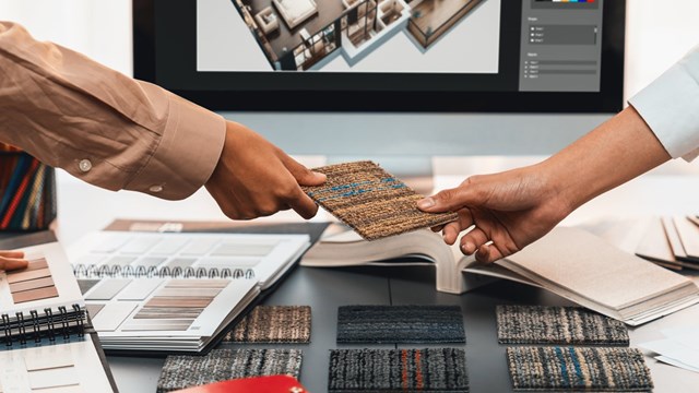
Fresh-cut flowers are expensive...and professional decorators and interior designers can be too. While buildings can certainly create a volunteer committee to plan and execute whatever upgrades their spaces need, most professionals will suggest you hire, well, a professional. Factoring a professional designer into your project budget could save money down the road, as designers often have relationships with vendors and can get better prices and more options for you than your board can at Home Depot.
Buildings with even a very modest design budget can work with an interior specialist. “There are so many options out there,” says Spates. “It all depends on how much effort you’re willing to put into searching for a great designer who fits your budget. In some cases, new designers are willing to work with a smaller budget in exchange for the right to use design images in their portfolio. So the key is to shop around and find the right person for your style and budget.”
“Have a designer come in and give a free budget estimate,” adds Lauren. “That will give you a good idea of what to expect. People are very unrealistic sometimes, thinking that a project shouldn’t be more than a certain dollar amount, without considering how much material it will take, how large the space is, how many floors need to be addressed, and that sort of thing.” And the cost of hiring a designer may not be as high as you think, Lauren continues. “The industry standard is 10-11 percent of the overall construction budget, but clients can also get a flat or hourly fee, and each job can be negotiated separately.”
Buscarello concurs. “My motto is, if you can afford to do the renovation - no matter what your budget - you can afford to hire a designer as a consultant for a few hours. Many designers will work on an hourly rate, and will consult at the beginning of your project.” He also cautions against going it alone, noting that “Designing by committee is inherently fraught with difficulties - it’s hard to agree on a color, let alone the overall design!”
If your building does want to go the do-it-yourself route, take to the Internet. Spates notes that ideas, how-tos and tips are just a click away. “The great thing about technology and the social media age is that you can find info about anything…Pinterest and Houzz are all great social media platforms to find cool DIY projects and décor tips. DIYNetwork.com and HouseBeautiful.com are also great sites that offer step by step instructions to unique décor ideas.”
Alyssa and her fiancé finally found their dream home - and they didn’t board the 80s ghost ship. “We found a great place that had common areas that I describe as ‘wonderfully unnoticeable,’” says Alyssa. “Neutral colored walls, inoffensive art and clean carpet. It’s perfect, because nothing sticks out as trendy or outdated, and it welcomes you to the building in an agreeable way.”
Alyssa points out maybe the most important tip: whatever you do to upgrade, don’t add an element that is too “now.” Just because “granny floral” is having a moment this year doesn’t mean it is going to be anyone’s cup of tea next year, let alone ten years from now. “Innocuous” might seem like a negative word, but when it comes to carpet colors and budgets, it never goes out of style.
Rebecca Fons is a freelance writer and entrepreneur, and a frequent contributor to The Cooperator.


Leave a Comment