Everyone agrees that a building's exterior and lobby make a lasting first impression. But have you ever noticed how many signs you pass between the curb and the apartment you are visiting? As we breeze through on our way upstairs, we barely notice these important pieces of print, yet they do make a lasting impression on us.
From the name and address on the awning outside to the All Visitors Must Be Announced sign posted in the entryway, from the No Smoking sign in the lobby to the Managed by Superlative Buildings, Inc. plaque posted in the elevator, these words are saying important things to us; things about the look and quality of the building. If little thought has been given to the style of these signs, they may say more than they intend to; they may convey the impression that the building design is not unified and that something was almost left out.
The possibilities for signage are endless, but you need a design professional to show you the various options and attendant costs while assisting you to create an overall theme. For complete interior signage programs, supplied and installed, a designer's cost usually runs from two to four percent of the total renovation budget. A professional will be instrumental in emphasizing signagean important, but often forgotten design element.
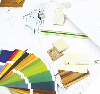
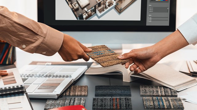
When designing the interior of a building, I like to have fun with signage. For example, signs can be color-coordinated with the wall covering and carpeting. Sometimes they can incorporate a building emblem or theme. We recently created a photo polymer building sign with borders inspired by the carpet border. In another case, we took an architectural motif and incorporated the design element into the signage. Such treatments create visual interest and project the image of a building with a well-planned design scheme.
Optional vs. Mandatory
Some signs enhance the quality of life in a building, while others are legally mandatory. Public spaces such as lobbies and hallways must conform to Fire Marshall regulations and codes governing life safety issues. Corridors generally require directional signs such as escape map routes, illuminated exit routes and signage both inside and outside stairwells. The Americans with Disabilities Act calls for signage in Braille at elevators and stairwells for handicapped tenants, shareholders and guests.
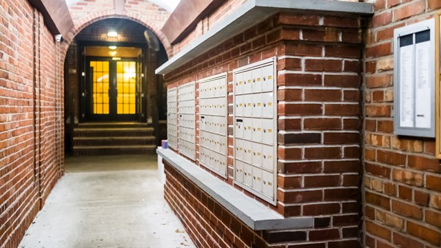
Sometimes, the board of directors or design committee of a building will choose to omit hallway signs indicating the location of an apartment or the floor directory. Other buildings find such information useful. Occasionally, we are asked to create an attractive bulletin board for the mailroom to be used for tenant notices. One of our clients requested that we design a decorative brass frame to be incorporated into the new elevator scheme. The frame would allow building management to post an-nouncements. A decorative easel may be appropriate for larger lobby displays.
Creating a Look
The first impression of a building is its written address. Generally, this appears on the building's awning or facade. The awning must indicate the street number on both the long sides of the canopy and on the short end, facing the curb. For maximum readability, the lettering should be clear and in a contrasting color to the awning material. The building name can also be displayed on the long sides of the awning. The curb side can feature a logo in addition to the street number.
The size of the numbers and lettering is extremely important. Over-sized characters seem to shoutcommuni-cating a commercial rather than residential tone. One rule of thumb is that numbers and words should not fill up the available space. Instead, there should be enough air, or breathing room, for legibility. The color of the awning should be its primary feature. Similarly, street-level signage such as a glass transom over a door or a plaque adjacent to a door is information, not a billboard.
The style of the lettering used in signage is critical. Your best bet is to keep it simple and easy to read. Helvetica, Optima and Caslon are just three of the most popular typefaces, but there are hundreds to choose from. When making your selection, keep in mind that legibility is the most important criterion, then size, color/contrast and, finally, the material from which the sign is made. It takes taste and experience to pull it together.
A Myriad of Materials
When it comes to choice of materials, there is a myriad of possibilities. Some are appropriate for outdoor use, others for indoor. Still others, such as metallics, can be used for either interior or exterior signage. Best of all, they are low maintenance, moderately priced, attractive and last a lifetime. Plaques in stone with applied or etched letters, although more expensive, are equally elegant, effective and durable. Metals like brass, aluminum, stainless steel, silk-screened laminates, acrylics and photopolymers make excellent interior signage. The photo polymers and aluminum are the most affordable. Old world methods such as hand-painting and gold leaf lettering are readily available, but are pricey.
Now that I have brought it to your attention, you will begin to realize how many signs you see in every building you enter. And while many boards dismiss signage as secondary, declaring, We'll use what we have or, We'll deal with that later, it should be considered a primary part of any building renovation. Your signs are a part of your design.


Leave a Comment